 Website Devices
Responsive design tester: see every screen at once
Checking a layout one device at a time in DevTools is slow, and bugs slip through. Website Devices puts phones, tablets and desktops next to each other in one Chrome tab, so you can spot broken layouts in seconds.
How to test a website on mobile and desktop
- Install Website Devices in Chrome (it also works in Edge).
- Open your page and click the extension icon.
- Pick the screens you care about — iPhone, Galaxy, Pixel, iPad, laptops, full-HD desktops, or your own custom sizes.
- Scroll, click and navigate once: every device follows in sync.
- Save full-page screenshots, or send a branded PDF report to your client.
What you can check
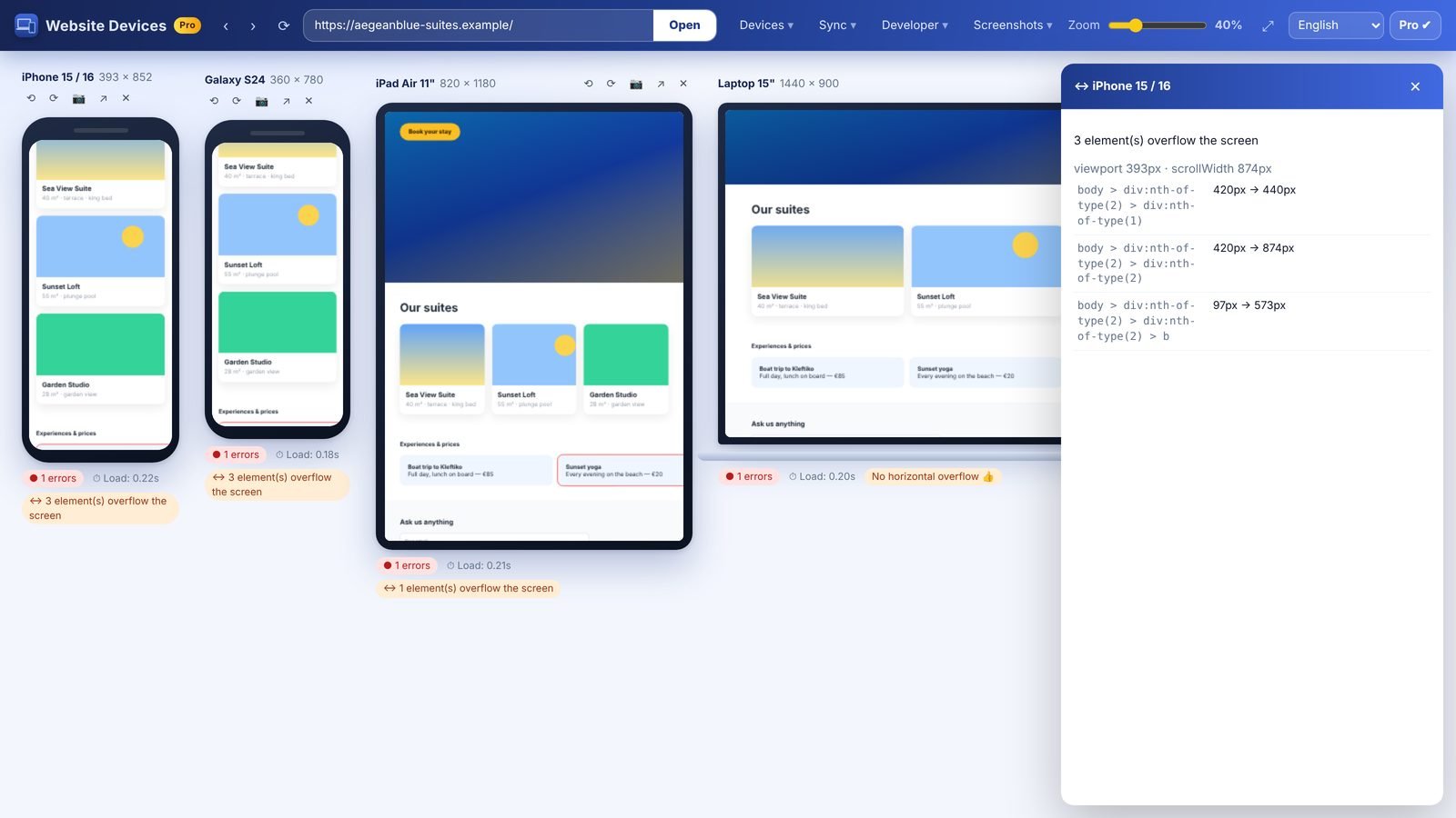
- Horizontal overflow and elements that break out of the screen
- Navigation menus, sticky headers and pop-ups on small screens
- Portrait and landscape orientation
- Load time and console errors per device
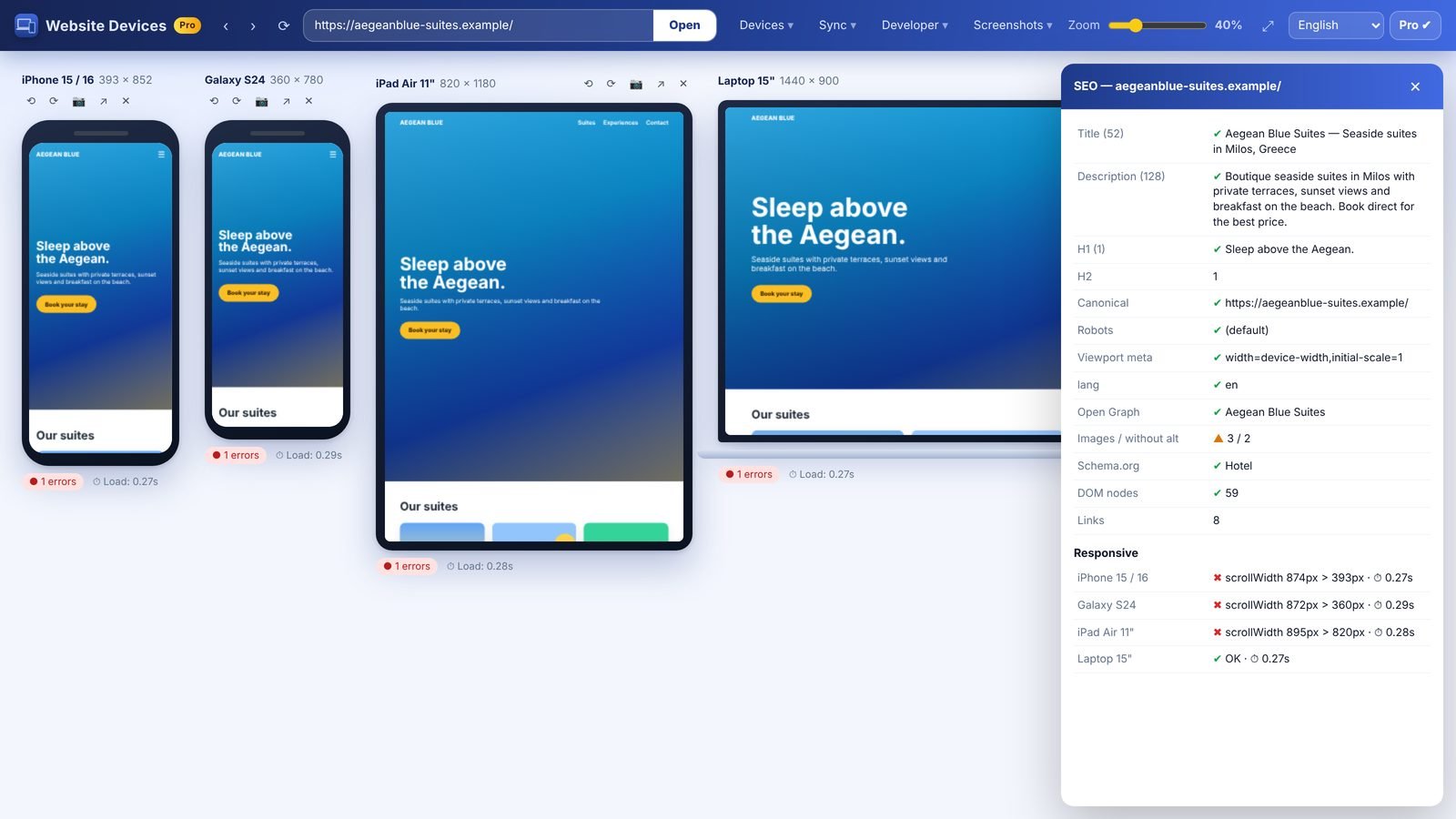
- SEO basics: title, meta description, headings, Open Graph tags
- Accessibility: contrast, tap-target size, missing labels and alt text
- With Pro Max: Google PageSpeed & Core Web Vitals, broken links and a technical SEO report
Try everything free for 3 days. Then Pro from €48/year (+ VAT). Cancel anytime.
Device names are trademarks of their respective owners and are used only to describe screen sizes. Website Devices is not affiliated with Apple, Samsung, Google or Xiaomi.